Concept project
Design-to-Code Landing Page with a Spec Overlay
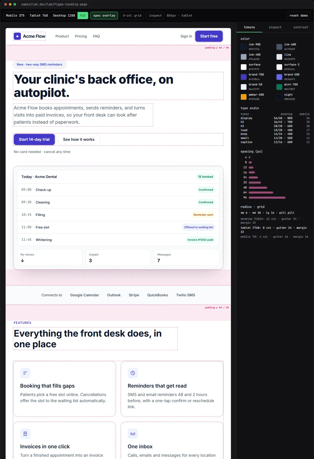
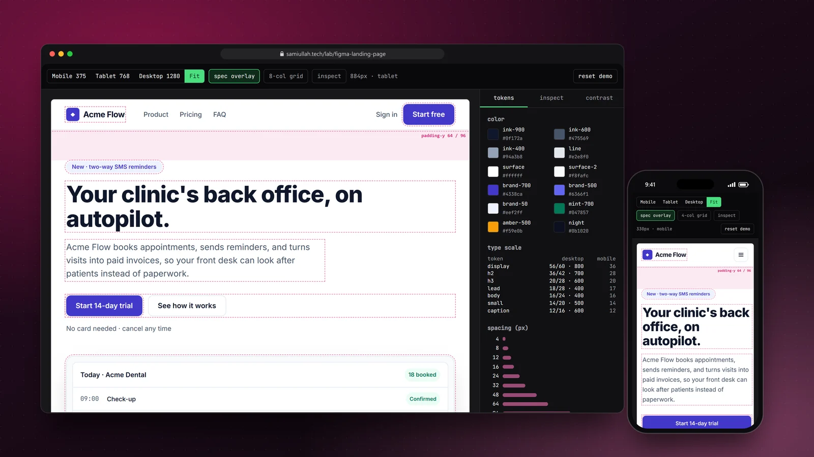
A concept project with a working demo: a responsive SaaS landing page built against a written design spec of tokens, type scale, grid and spacing. The demo shows it like a design handoff, with phone, tablet and desktop frames, a spec overlay, a column grid, an element inspector that maps styles back to tokens, and a contrast table.
Overview#
A lot of frontend work starts with a design file and a deadline. The result is judged on two things: does it look like the design at every size, and does it still work for keyboard users, slow phones and people who need more contrast.
This concept shows how I approach that job. I wrote the design spec first (colour tokens, a type scale, spacing steps and a 12/8/4 column grid) as if it had come from Figma variables, then built a landing page for a fictional product, "Acme Flow", against it. The live demo shows the page the way a designer would review it: in device frames, with a spec overlay, a grid and an inspector.
My role#
Everything: the spec, the copy, the page, the overlay and inspector, and this write-up. It is a concept project. There is no Figma file from a designer behind it, the product is fictional, and the one quote on the page is labelled as fictional.
The problem#
Design-to-code drift usually comes from small decisions made in code that nobody wrote down:
- a heading set to 34px because it "looked right", which matches no step in the type scale,
- a colour picked with an eyedropper that is one shade off the brand token,
- spacing that changes between sections because each was built on a different day,
- breakpoints checked by dragging a browser window instead of at the agreed widths.
The fix is to make the spec the vocabulary of the code, and to make it easy to check the build against the spec at the agreed sizes.
Approach & architecture#
- tokens.tsthen
- CSS custom propertiesthen
- Landing.tsx (every colour and radius)
- tokens.tsthen
- handoff panel (tokens, grid, contrast table)
- getComputedStyle(clicked element)then
- rgbToHexthen
- tokenForHexthen
- inspector
Tokens as the vocabulary. Colours, type steps, spacing, radii and the grid live in tokens.ts. The page root receives the colours and radii as custom properties, and components use them by name, for example bg-[var(--af-brand-700)]:
export function cssVars(): Record<string, string> {
  const vars: Record<string, string> = {};
  for (const [k, v] of Object.entries(COLORS)) vars[`--af-${k}`] = v;
  for (const [k, r] of Object.entries(RADIUS)) vars[`--af-r-${k}`] = `${r}px`;
  return vars;
}
Container queries, not media queries. The device buttons change the width of the frame, not the browser. Because the page uses Tailwind's container variants (@3xl: for the 768px tablet frame, @5xl: for desktop), it reflows inside the frame exactly as it would on that screen:
<div className={`${wrap} grid items-center gap-12 py-16 @5xl:grid-cols-12 @5xl:py-24`}>
  <div className="@5xl:col-span-6">…</div>
</div>
The handoff layer. Elements carry a short data-spec string such as display · 56/60 · 800 · ink-900 (36/40 mobile). When the overlay is on, scoped CSS outlines them, shows the spec on hover and tints each section's vertical padding. A container query inside that CSS switches the padding label from 64 to 96 at the desktop width, matching the layout. The grid toggle draws the 12, 8 or 4 columns with the right gutters and margins for the current frame.
The inspector. In inspect mode, a click or a Tab focus inside the frame is captured, and the panel shows getComputedStyle() for that element: size, font, padding, radius, gap, and colours converted to hex and matched back to token names. A colour that is not a token is flagged.
Key challenges#
- Contrast is part of the spec. The lighter brand colour,
brand-500, measures 4.47:1 on white, just under the 4.5:1 WCAG AA needs for normal text, so buttons usebrand-700(7.90:1) andbrand-500is only allowed for large text. My first draft also used a lighter green (#059669, 3.77:1) for the status chips and slateink-400(2.56:1) for the times in the hero mock. The check caught both, and I moved them tomint-700(5.48:1) andink-600. The contrast tab computes the pairs with the WCAG luminance formula; the numbers here come from the same function. - Interactive parts that work by keyboard. The mobile menu button sets
aria-expandedandaria-controls. The billing toggle is a radio group with arrow-key support. The FAQ uses buttons witharia-expandedthat control labelled regions, and the email form links its error to the input witharia-describedby. - Overlay CSS without touching the site's styles. The overlay rules are a small stylesheet rendered inside the demo and scoped to one class on the frame, so they cannot leak into the rest of the portfolio.
- No images to wait for. The product screenshot in the hero is HTML and CSS, so it stays sharp at every size, uses the same tokens, and adds no image requests.
- Reduced motion. The only animation, the FAQ icon rotation, is turned off with
motion-reduce.
Tech stack#
- Demo: TypeScript, React 19, Next.js and Tailwind CSS 4 with container queries. Tokens and colour maths are in
tokens.ts, the page inLanding.tsx, and the frame, overlay and inspector inDemo.tsx. Settings persist inlocalStorage. - Production design: tokens exported from Figma variables into the Tailwind theme, one component per section with typed content props so the copy can move to a CMS,
next/fontandnext/imagefor the real assets, and a server action for the email form.
Results#
- A complete, responsive landing page: navigation with a mobile menu, hero with a product mock, feature grid, steps, quote, pricing with a monthly and yearly toggle, FAQ accordion, email form with validation, and footer.
- Every text colour pair listed in the contrast tab passes WCAG AA for the text size it is used at.
- The spec overlay, grid and inspector let anyone check spacing, type and colours against the tokens at the three agreed widths.
This is a concept build without real users or traffic, so I make no claims about conversion or performance in the field.
Try the demo#
Open the landing page demo. Things to try:
- Switch between Mobile 375, Tablet 768 and Desktop 1280 and watch the grid button change from 4 to 8 to 12 columns.
- Turn on inspect and click the "Start 14-day trial" button. The panel shows
brand-700and its contrast ratio. - Hover outlined elements with the spec overlay on to read their type and spacing specs.
- Open the contrast tab and find the one pair that only passes for large text.
What I would do next#
- Add a side-by-side mode that places a design export over the page at reduced opacity, for real client files.
- Generate
tokens.tsfrom a Figma variables export with a small script, so the code cannot drift from the file. - Run Lighthouse and axe on the page as its own route and record the results here.
- Add visual regression screenshots at the three widths in CI.