Concept project
Custom WordPress Theme from a Figma Design
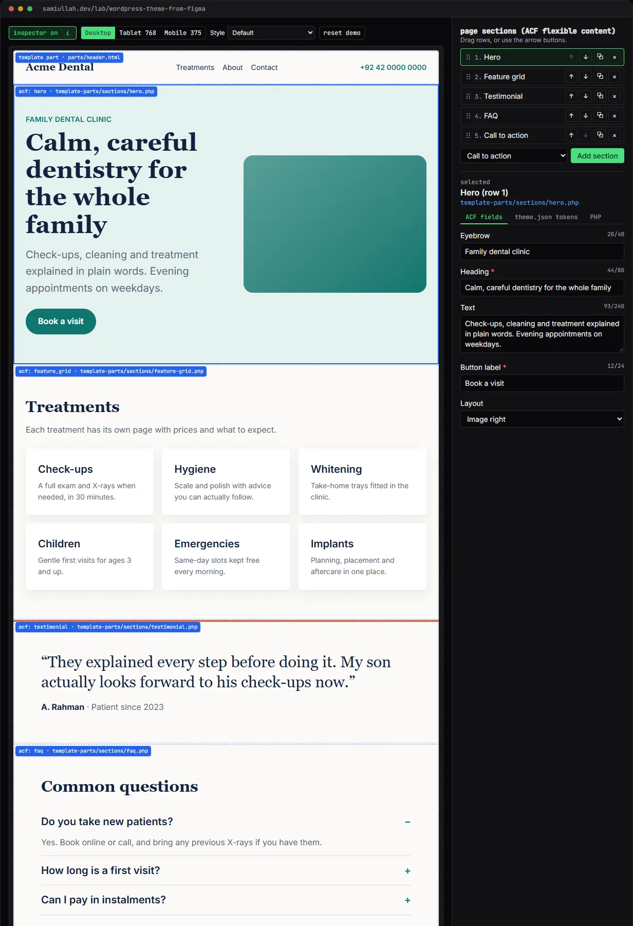
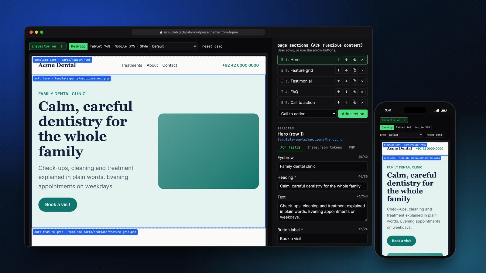
A concept project with a working demo: a custom WordPress theme page for a fictional dental clinic, built from theme.json design tokens and ACF flexible content sections instead of a page builder. An inspector shows which template part, fields and tokens make each section, and editors can change, reorder and add sections.
Overview#
This concept shows how I turn a design into a hand-built WordPress theme that an editor can update without breaking it. There is no page builder. The design lives in theme.json, the page content lives in ACF fields, and each section is a small PHP template part.
The live demo is a home page for a made-up clinic, Acme Dental. Turn on the inspector and each section is outlined with the file that renders it. Select one to see its fields, the design tokens it uses and its PHP.
My role#
Everything: the token set, the field design, the PHP template parts, the browser preview and this write-up. It is a concept project; the clinic and its content are invented, and there is no client Figma file behind it.
The problem#
Two things usually go wrong when a design becomes a WordPress site:
- The design drifts. Colours and sizes get typed into CSS by hand, again and again. A brand change becomes a search-and-replace across files.
- Editors get too much or too little. A page builder lets them break the layout. Hard-coded templates mean every text change needs a developer.
The goal is a middle path: editors choose from a fixed set of sections and fill in fields; the design system decides how it looks.
Approach & architecture#
- Figma stylesthen
- theme.json presetsthen
- CSS custom propertiesthen
- section template parts
- Editorthen
- ACF flexible content rowsthen
- page-sections blockthen
- get_template_part per row
Tokens in theme.json. The palette, font sizes, spacing scale and widths are presets in theme.json. WordPress turns them into custom properties, and the block editor offers only these values. Three font sizes are fluid:
{ "slug": "xx-large", "name": "Huge", "size": "3.25rem", "fluid": { "min": "2.125rem", "max": "3.75rem" } }The demo's fluidSize() reproduces the clamp() WordPress generates, interpolating between the 360 px and 1200 px viewport widths. A style variation (styles/evening.json) overrides only the palette, so a dark version of the site is one file.
Sections as ACF flexible content. The page body is one flexible content field with five layouts. Field groups are registered in PHP with acf_add_local_field_group and also saved as ACF JSON in the theme, so they are in version control. A small ACF block in the block template loops the rows and loads one template part per layout:
while ( have_rows( 'sections' ) ) {
	the_row();
	$layout = get_row_layout(); // hero | feature_grid | testimonial | faq | cta
	get_template_part( 'template-parts/sections/' . str_replace( '_', '-', sanitize_key( $layout ) ), null, get_row( true ) );
}
Escaped output. Every template part escapes at the point of output: esc_html for text, esc_url for links, esc_attr for attributes, and wp_kses_post only for the FAQ answer, which allows paragraphs. Images come from wp_get_attachment_image, so WordPress adds width, height, srcset and sizes; the hero is marked eager with high fetch priority.
Header and footer as template parts. They are block template parts, with three tiny ACF blocks that read the phone, address and hours from an options page. Changing the phone number once updates every page.
Key challenges#
- One source of truth for design values. No section hard-codes a colour or size; each reads a
--wp--preset--*variable. The inspector lists the tokens each section uses with their resolved values, and switching the style variation proves it: only the palette file changes. - Responsive preview inside a page. The preview is a resizable box, not the browser window, so the demo uses CSS container queries and container units where the theme uses media queries and viewport units.
- Guard rails for editors. Required fields, maximum lengths and minimum and maximum repeater rows are set on the fields, so an editor cannot save a hero without a heading or a grid with one item. The demo shows the same messages live.
- An accessible FAQ. The accordion uses real buttons with
aria-expandedandaria-controls, and the same rows feed FAQPage JSON-LD, shown in the PHP panel. - Reordering without a mouse. Sections can be dragged, and each row also has up and down buttons with a screen-reader announcement of the new position.
Tech stack#
- Demo: TypeScript, React and Next.js.
theme.tsreads the realtheme.jsonand style variation, defines the ACF layouts and validates values; sections are React twins of the PHP template parts. State is saved inlocalStorage. - Production design: WordPress with a block theme (
theme.json, block templates and template parts), ACF Pro for flexible content and the options page, PHP template parts per section, and Vite for one small CSS file and one deferred script.
Results#
- A working theme page with five section types, a header and a footer, all styled only from
theme.jsonpresets. - An inspector that maps every section to its file, fields, tokens and PHP.
- Live editing with ACF-style validation, reordering by drag or keyboard, adding and removing sections, a second style variation and three preview widths.
This is a concept build; it has not been used by a real clinic, and there is no real Figma file or client behind it.
Try the demo#
Open the theme demo. Things to try:
- Select the hero and switch its layout to Centered, then clear the heading to see the required-field message.
- Move the FAQ above the treatments grid with the arrow buttons, then add a second call to action.
- Switch the style to Evening and the width to Mobile 375, and watch the fluid heading size change.
What I would do next#
- Build the real theme from a licensed community Figma file and check spacing at 375 px and 1440 px with an overlay.
- Run Theme Check and Lighthouse on a deployed demo and publish the reports.
- Add a services custom post type with its own archive, linked from the feature grid items.